Skip to Content

Rethinking Your Weatherman’s Map

Recently, my team and I were tasked with performing a master plan and hydraulic model for a water utility whose service area covered 25 square miles and supported a population of 70,000. Our analysis of a 15-year planning horizon resulted in more than $50-million in recommended system improvements.

By James Floystrop

Jim Floystrop

Recently, my team and I were tasked with performing a master plan and hydraulic model for a water utility whose service area covered 25 square miles and supported a population of 70,000. Our analysis of a 15-year planning horizon resulted in more than $50-million in recommended system improvements.

The Challenge: Graphically Representing Fire Flows

We used Bentley’s WaterGEMS, a water distribution system hydraulic modeling program, to perform our analysis. However, attempting to graphically represent the fire flows—amount of flow of water the system could deliver for fighting fires—presented a challenge. To represent such a vast geographic area, the standard “contour method” we used for showing water system pressures would not be able to show the fire flows clearly and WaterGEMS did not have the built-in capability to graphically present the fire flows the way we wanted.

While researching an unrelated matter, I discovered a dasymetric map, typically used to graphically present information, such as population densities and weather, over a geographic map by using color to spatially classify data. The most common form of dasymetric maps are the temperature maps used by weathermen during news broadcasts.

A Labor Intensive Process

It turns out the process to get from WaterGEMS to a dasymetric map is labor intensive, but worthwhile. We exported our data from WaterGEMS with coordinates that labeled the horizontal locations and available fire flow rate. We then imported the information into Carlson Civil to generate a color 3D grid surface, using our data points where each corner of the grid represented a flow rate. Lastly, vector graphics were cleaned up in AutoCAD for our final presentation.
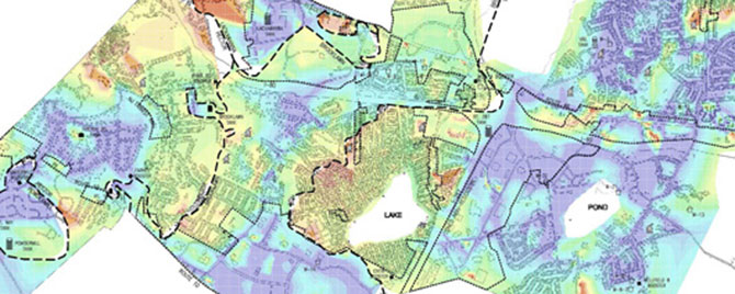
Dasymetric-Map_Plate-A

The dasymetric map was extremely useful for simplifying comparison of fire flow maps under existing conditions…
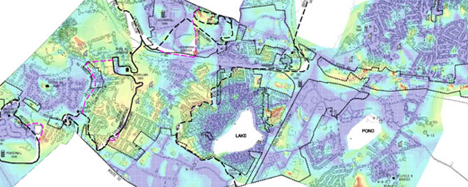
Dasymetric-Map_Plate-B

…and proposed conditions, to get a visual representation of the benefits of implementing the recommended improvements.
About the Author

James Floystrop

Related Insights

Healthcare Construction & Operations News

September 23, 2026

In this article for Healthcare Construction & Operations News, Melissa Covington and Heather Platt, PE, CHC discuss the modernization of Oklahoma State University Medical Center's labor and delivery facilities while maintaining ongoing hospital operations. The authors highlight the planning, collaboration, and innovative design solutions required to upgrade critical healthcare spaces within an existing facility and share key lessons learned for healthcare renovation projects.

Publication

Our approach combines a ground-based camera and traditional survey equipment to collect accurate data without physical contact with energized assets.

August 27, 2026

For decades, utilities have relied on mechanical calipers to measure transmission wire diameters. However, this approach requires survey crews to either climb transmission towers or maneuver heavy bucket trucks into energized zones, creating significant safety risks, operational challenges, and…

Blog

Integrating lidar and other 3D data into GIS gives utilities a detailed view of terrain and infrastructure, enabling more accurate transmission line and substation design, clearance analysis, and project planning.

August 20, 2026

Electric power utilities face many challenges today — rising power and supply chain costs, sharply increasing demand from large loads like data centers, major changes in federal energy policies, and a growing imperative to invest in grid hardening and resilience.

Blog

Dimensions®

Our annual review and corporate social responsibility report, in one place.